CLAREMONT DOES IT RIGHT!
My latest tour visited the east LA County city of Claremont. This college town is truly one of the prettiest and most friendly in Southern California. Originally founded by the Santa Fe Railroad, the town benefitted from…
LA Skyscraper Tour – Fun on the Rails!
One of my absolute favorite tours is the “Four Rail” LA Skyscraper Tour. Not only do we see 100 years of skyscraper design evolution, we also ride subways, light rail, funiculars and Amtrak. The city looks a lot differen…
COMMUNITY SIGNS: Pointing in the Right Direction
| Double-faced, projecting, custom signs work at pedestrian-scale. |
Signs are the most consistently colorful feature of cities – a fact that can be both good and bad. Commercial signs can be gorgeous and well-integrated to the architecture, especially in in wealthy cities with lots of design controls. But, in most cities, commercial signs are often non-descript, poorly coordinated and clutter up the streetscape. But this is a topic for a future blog. Today we will look at community signs, and, once again, things are changing for the better.
Community Wayfinding Signs – It took us long enough, but planners finally realized that our cities need iconic signs to tell us where the cool stuff is. And the sign itself can be a symbol for the city you’re in. Santa Barbara’s new community directional sign serves double duty – it helps orient the visitor and reminds them of the city’s culture.
| Community wayfinding signs help the travelor to know that they’re heading for some key destinations. |
| San Juan Capistrano’s new signs have the rounded top symbolic of the mission’s curved bell gable. |
| Bravo LA! This wayfinding sign brands the district – Chinatown – and helps people find destinations within it. Newport Beach’s oval signs catch the eye and have |
Less imageable cities need wayfinding signs as well, and perhaps even more. Your city may not be the most exciting, but you do have destinations like the library, City Hall, the park. Designing an attractive community sign program can help give you city a stronger sense of identity.
| Laguna Hills has made its top destinations easier to get to with attractive new signs. |
Street Signs – Something as seemingly boring as a street sign can also make a big difference to a community’s image. Street signs are on almost every corner, so why not give them some pizzazz?
| Ventura’s street sign is the most beautiful I have seen. The Mission, a palm tree, blue sky, cool border – the sign says a lot. |
| Beverly Hills goes for the elegant look with gold lettering on a dark metal background |
San Luis Obispo uses earthy colors and a cool font. |
|
Highland, in San Bernardino County, reminds residents of its Santa Monica is into sign minimalism! |
| Rancho Mirage put a big horn sheep on its street signs |
American Plazas: Increasingly Sittable thanks to William Whyte!
| Sitting places are now a big priority for shopping centers. |
Have you noticed lately that many shopping centers are becoming quite sittable? Have you seen leather chairs, outdoor fireplaces and cafe tables “a la Europa” inside of your local mall? Well, it hasn’t always been this way, and I think there is one man who really started this comfort movement with a landmark study over 30 years ago. His name is William Whyte, and he’s my hero.
 |
| Sociologist, urbanist, plaza guru |
 |
| Moveable seating is the best. |
 |
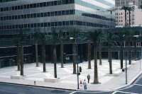
| In the 1970s and 80s, developers often added plazas to get more floors on their buildings. Can you see why many were unsuccessful? |
1). Is the plaza close to the street – not raised and not sunken – and can passersby see it?
2). Does it have lots of comfortable seating options?
3). Does the plaza provide a sense of visual enclosure without being cut off from surrounding areas?
4). Does it contain an interesting visual feature or focal point that draws attention?
Below you’ll find mostly good examples of public gathering places analyzed from Whtye’s research. His work reminds us that cities are inherently social places.
| Boulder’s Pearl Street Mall is one of the best public spaces in US I have ever seen. A great space works for all ages. |
| Third Street Promenade in Santa Monica filled a large central area with dinosaur topiary to create interest and more intimate public space. |
| The City of Brea does a good job with accessible and touchable public art |
 |
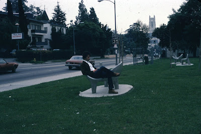
| Ouch!! Good example of what not to do. Fixed benches, isolated, no sense of enclosure, orientede away from the street. |
 |
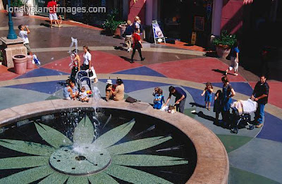
| Fashion Island’s spitting fountain is sittable and highly entertaining. |
| People do not like to stop in the middle of large public places. LA’s Cathedral of Our Lady of the Angels is over-scaled and totally cut off from the street. |
| Hollywood Blvd’s Kodak Theatre Plaza finally gave the tourists a place to get comfortable after seeing Marilyn Monroe look-alikes at Mann’s Chinese Theatre. |
| Traditionally suburban towns like San Clemente are beginning to incorporate sitting areas in their emerging town centers. |
 |
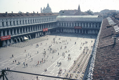
| The Europeans had a head start. St. Mark’s Square in Venice has well-defined urban space and lots of movable seating. And it looks like pigeons can get people to stop in the middle of large spaces. |
| Sittability, comfort, options, sense of enclosure but still part of the urban flow. That’s exactly what William Whyte documented! |
One Urban Explorer 2011-08-25 08:24:00
INTRODUCTION: Exploring the Best in Cities
My urban eye is always attuned to those urban jewels in our built environment. The passion is akin to bird-watching although buildings usually stay put. I believe that American cities are slowly becoming more interesting, more people friendly, and more attractive. This blog is my attempt to document these positive trends. Join me!
The photos below will give you an introduction to some of the topics I will explore.
| San Luis Obispo’s Freemont Theatre is a wonderful example of Art Deco architecture. And those neon lights are killer! |
| Street signs can do a lot to create a sense of identity for a city. They are fairly cheap and more cities, like Ventura (pictured here), should consider their potential. |
| LA Chinatown’s historic plaza is a great example of well-defined urban space. |
| Have you noticed that many shopping centers are doing a better job providing people with comfortable places to sit? Here’s the central plaza at Santa Monica Place. |
| Banners add color and rhythm to the streetscape and highlight key city events and themes. |
| Street fairs and Saturday markets are a wonderful way to combine good food and sociability – a brief and stimulating way to reclaim the street from cars. |
| Public art adds a special touch to town centers. It looks like Brea does have a good sense of timing. |
