 |
| Double-faced, projecting, custom signs work at pedestrian-scale. |

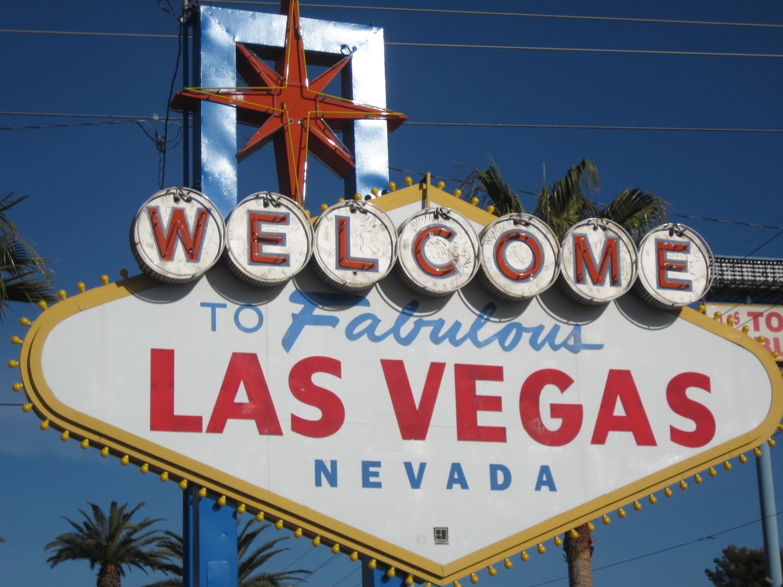
Some community signs, like the "Welcome to Las Vegas", are iconic. At a single glance, they represent their cities. But what if a city has a less memorable image? In those cases, planners and designers take a city's most memorable symbols and put them on their community signs. These signs are popping up all over and are helping to reinforce their city's image. If it's an ugly sign, not to worry! Psychologists point out that the longer we look at something - even something quite plain - the more we like it. This "mere exposure effect: might also explain why we all think we're pretty good looking! This third edition of my blog will examine two trends in community signage: community wayfinding and street signs.
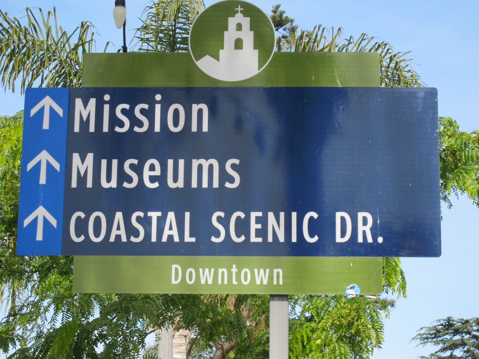 |
| Community wayfinding signs help the travelor to know that they're heading for some key destinations. |
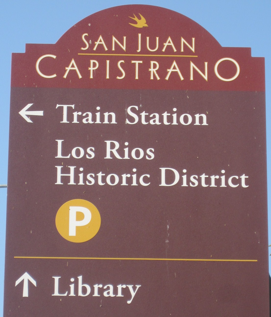 |
| San Juan Capistrano's new signs have the rounded top symbolic of the mission's curved bell gable. |
Big cities are in special need of wayfinding signs. LA is so big and spread out, and contains so many distinct districts, that people get lost all the time. One of the most famous American urban designers and theorists - Kevin Lynch (The Image of the City, 1980) - thought that cities should be "legible" or readible so that people know where they are. One characteristic of "legible" or imageable cities is that they contain districts of distinct identity that help make a city interesting and diverse.
 |
| Bravo LA! This wayfinding sign brands the district - Chinatown - and helps people find destinations within it.  good color contrast. |
 |
| Laguna Hills has made its top destinations easier to get to with attractive new signs. |
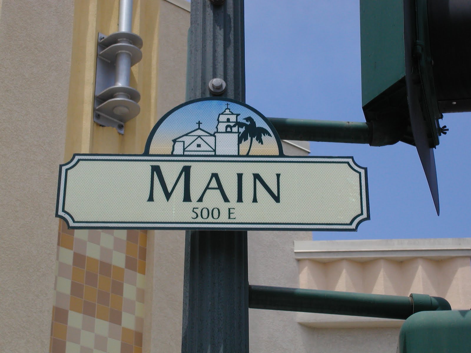 |
| Ventura's street sign is the most beautiful I have seen. The Mission, a palm tree, blue sky, cool border - the sign says a lot. |
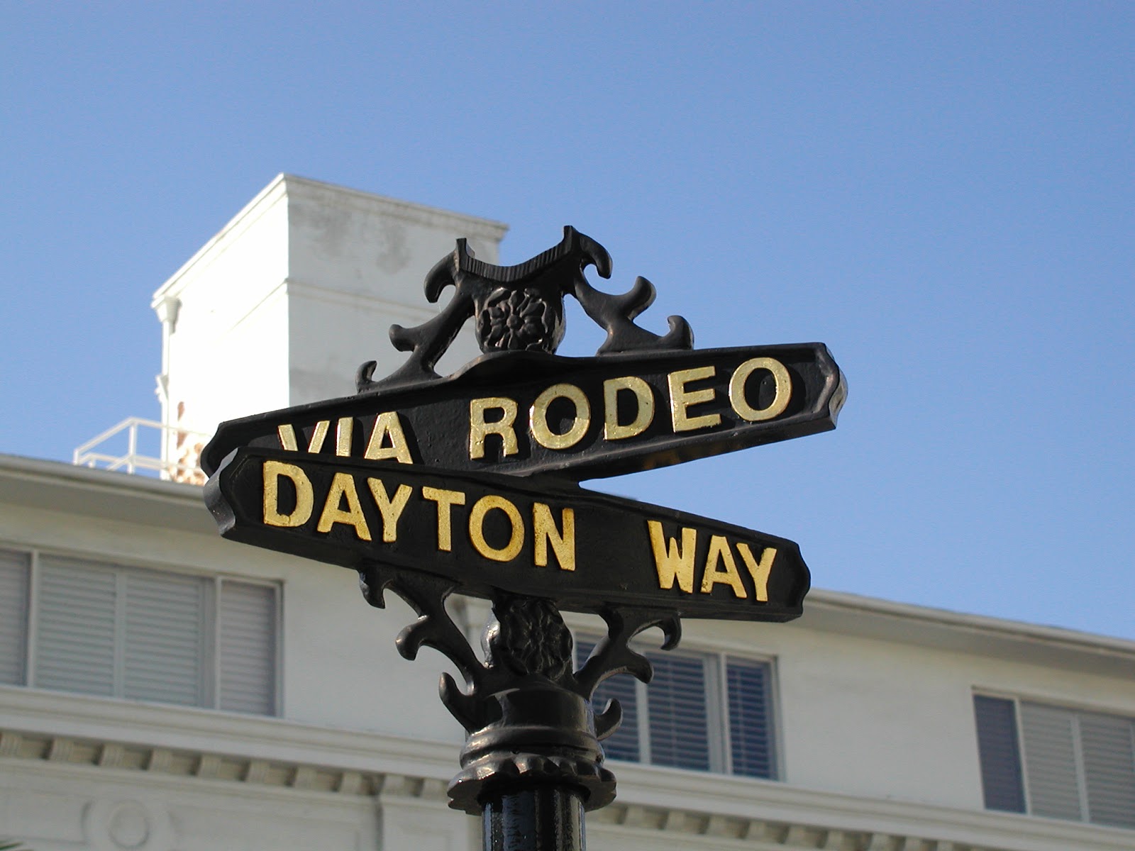 |
| Beverly Hills goes for the elegant look with gold lettering on a dark metal background |
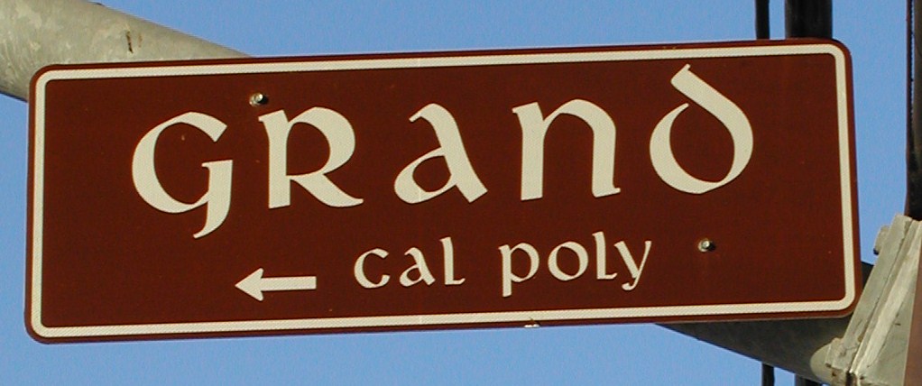 San Luis Obispo uses earthy colors and a cool font. |
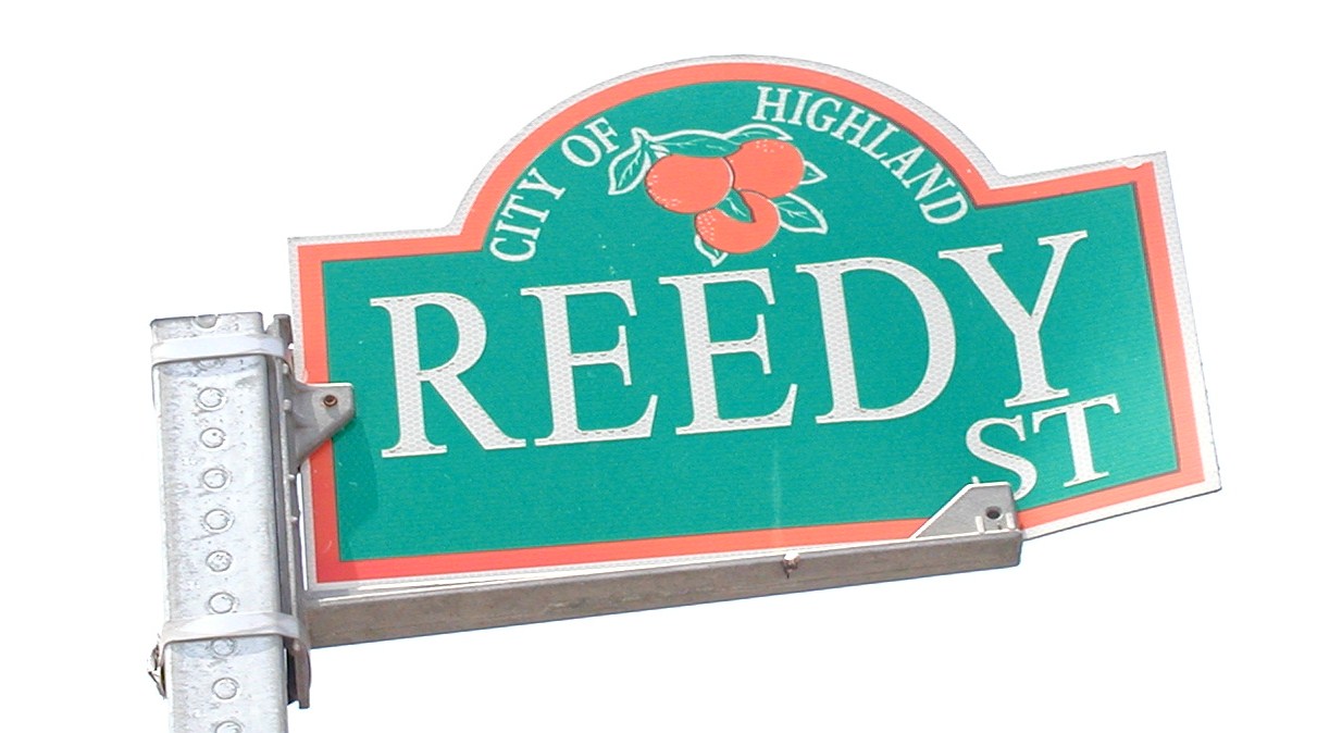 citrus past. |

 |
| Rancho Mirage put a big horn sheep on its street signs |